Workspace
The workspace is the root of the Nexora interface. It contains the persistent sidebar on the left and a context-dependent main content area on the right. When no chat or section is open, the main area shows the workspace home with quick-start actions.
Sidebar
The sidebar is 280 px wide and persists across all sections. It can be collapsed to an icon rail using the collapse toggle.
Logo and collapse toggle
The top of the sidebar shows the Nexora logo alongside a bolt icon. To the right of the logo is a collapse toggle — a chevron-left button. Clicking it collapses the sidebar to a narrow icon rail; clicking the chevron-right button that appears in collapsed state expands it again.
Org switcher
Directly below the logo row is the org switcher button. It displays:
- A circular avatar showing the first letter of the organization name (e.g. “D”)
- The organization name (e.g. “Docs User’s Workspace”)
- An “Owner” role badge indicating the current user’s role in this org
- A chevron indicating the button is a dropdown
To the right of the org switcher is a bell icon (notifications button) for in-app notifications.
Clicking the org switcher opens a dropdown that lists all organizations the current user belongs to, with an option to create a new organization.
New chat and search
Below the org switcher are two controls:
- New chat button — a
+icon button that immediately creates a new chat session and focuses the message input - Search chats field — a text input with a search icon, labeled “Search chats…”. Typing here performs a live full-text search across all chat titles in the organization
Chat list
The chat list occupies the main body of the sidebar below the search field. Chats are grouped by recency under expandable group headers:
| Group | Criteria |
|---|---|
| Today | Chats created or updated today |
| Yesterday | Chats from yesterday |
| Previous 7 days | Older chats within the last week |
| Older | Everything else |
Each group header is clickable — clicking it collapses or expands that date group.
Each chat item in the list shows:
- A chat icon (speech bubble)
- The truncated chat title (derived from the first message)
- A delete button (trash icon) that appears on hover
Clicking a chat item opens that chat in the main content area.
User button
At the very bottom of the sidebar is the user button. It displays:
- A circular avatar icon
- The user’s full name
- The user’s email address
Clicking the user button opens the user dropdown menu.
User dropdown menu
The user dropdown appears above the user button, anchored to the bottom-left of the screen.
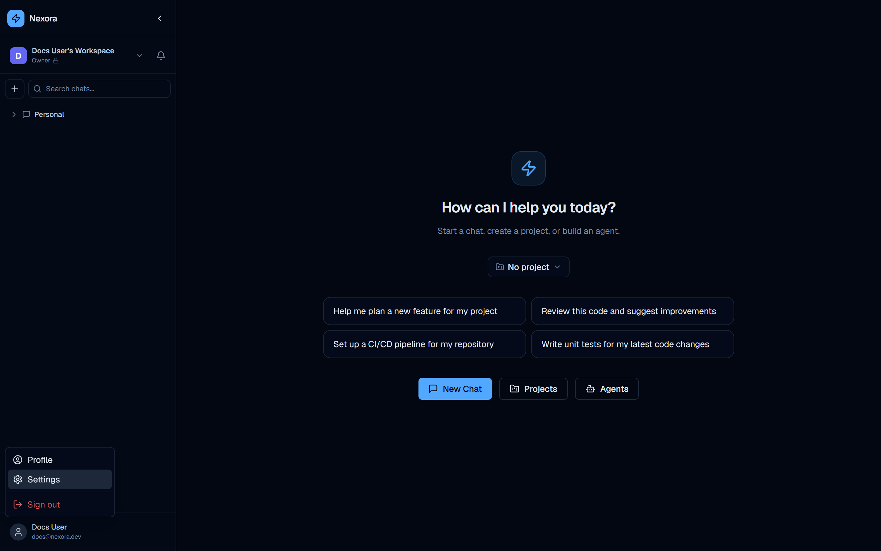
The menu contains three items:
| Item | Icon | Behavior |
|---|---|---|
| Profile | Person icon | Navigates to /profile — user profile and 2FA settings |
| Settings | Gear icon | Navigates to /settings — provider accounts, models, integrations |
| Sign out | Exit icon (red) | Signs the current user out and redirects to the login page |
The Settings item highlights in blue on hover (visible in screenshot 05-sidebar-settings-hover.png). The Sign out item uses red text and a red icon to distinguish it as a destructive action.
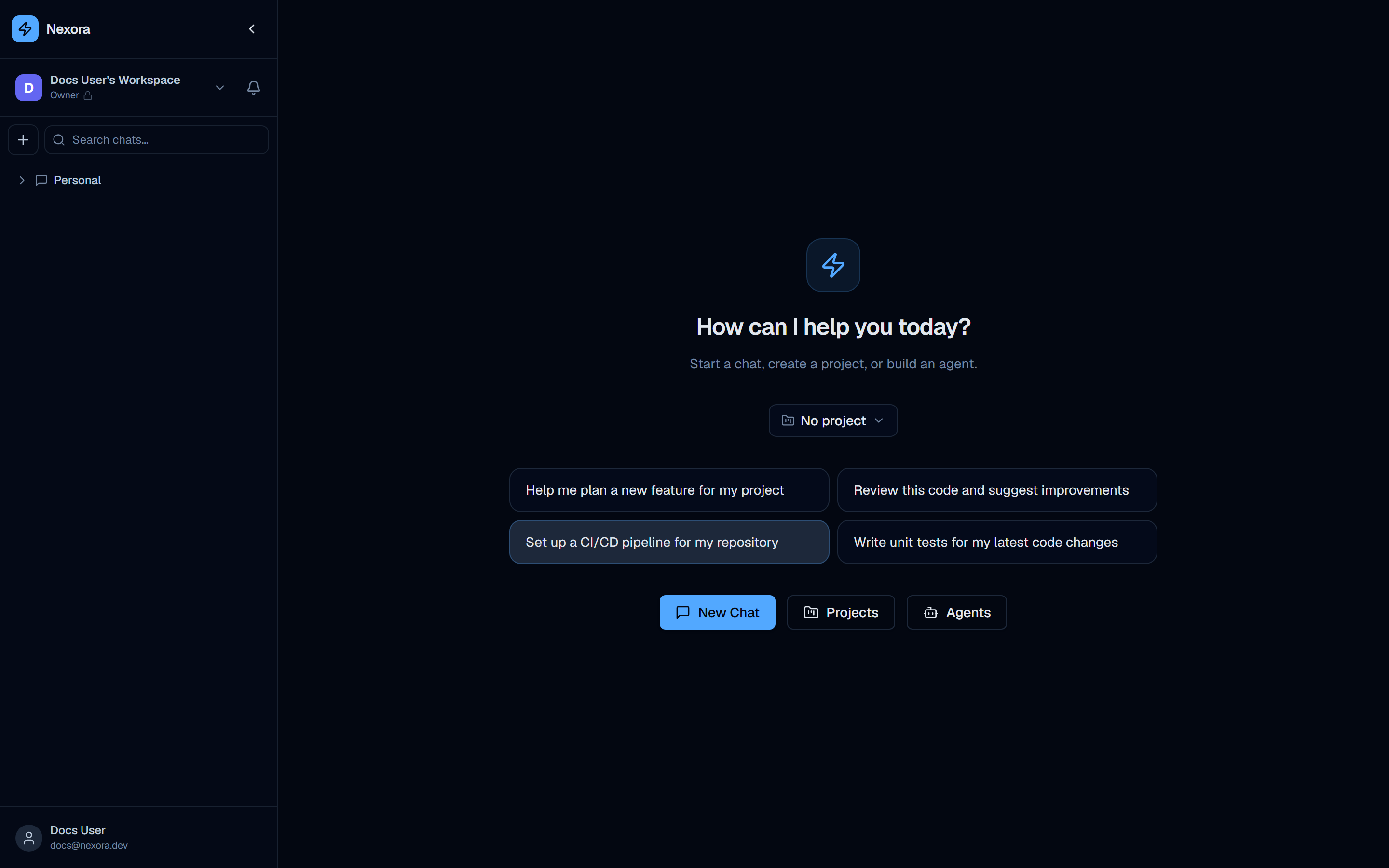
Workspace home (empty state)
When no chat is open, the main content area displays the workspace home screen.
Center content
The center of the main area shows:
- The Nexora bolt icon (large, decorative)
- “How can I help you today?” — main heading
- “Start a chat, create a project, or build an agent.” — subtitle
Project scope selector
Below the heading is a “No project” dropdown button. This is the project scope selector — it lets you set the active project context before starting a chat. Chats started with a project selected are automatically associated with that project and have access to its context.
Quick-start suggestion buttons
Four pre-written suggestion buttons provide one-click starting points for common developer workflows:
- “Help me plan a new feature for my project”
- “Review this code and suggest improvements”
- “Set up a CI/CD pipeline for my repository”
- “Write unit tests for my latest code changes”
Clicking any suggestion button creates a new chat with that text pre-filled and submitted as the first message.
Action buttons
Three primary action buttons sit below the suggestions:
| Button | Style | Action |
|---|---|---|
| New Chat | Blue, primary | Creates a new empty chat and focuses the input |
| Projects | Secondary | Navigates to /projects |
| Agents | Secondary | Navigates to /agents |
Navigating the interface
All major sections are accessible via direct URL or from within the interface. The table below maps every section to its URL:
| URL | Section |
|---|---|
/chat | Chat workspace |
/agents | Agent management and builder |
/channels | Telegram and webhook channels |
/projects | Projects kanban board |
/issues | Issue tracker |
/schedules | Scheduled agent tasks |
/skills | Skills catalog |
/tools | Tools library |
/personas | Persona library |
/mcps | MCP servers |
/profile | User profile |
/org | Organization settings |
/settings | Provider accounts and settings |
The sidebar does not contain explicit navigation links for every section — use the URLs above or reach sections via contextual buttons (for example, the “Agents” button on the workspace home, or the “Settings” item in the user dropdown).
Collapsing the sidebar
Click the collapse toggle
Click the chevron-left button at the top-right corner of the sidebar. The sidebar animates to a narrow icon rail, showing only icons without labels.
Navigate in collapsed mode
All sidebar functionality remains available in collapsed mode. Hover over icons to see tooltips. The user button at the bottom still opens the dropdown menu.
Expand the sidebar
Click the chevron-right button (which replaces the chevron-left in collapsed state) to restore the full sidebar.
Sidebar collapse state is persisted per browser — refreshing the page maintains the collapsed or expanded state.